The day we finally clap eyes on the 2018/19 Cardiff City kit is almost upon us but before we’re all put out of our misery, let’s take a look at the concepts fans have created.
Let’s kick off with Adam’s sweet home shirt. Not only does it bear similarities to the wonderful 2016/17 shirt, it adds extra yellow and the genius decision to put Kenny Rogers’ Roasters on the sleeve. We live in hope.
This was my 2018/19 Mock-up, including Malaysian Sleeve Sponsor. pic.twitter.com/1sqV30k8Nk
— Adam ??????? ?? #FBPE (@adam85james) June 22, 2018
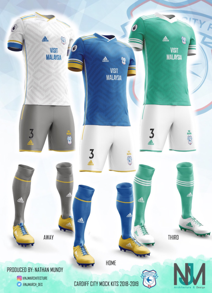
We move on to talented London-based designer Nathan Mundy.
My take on the new @CardiffCityFC @adidasfootball kits for the 2018-2019 @premierleague season. #cardiffcity #cityasone #bluebirds #ccfc #kits #GraphicDesign #business #premierleague #adidas # @mendezlaing19 @jnrhoilett @KevMcnaughton @JoeBennett27 @adidasUK pic.twitter.com/AUGOAbWJab
— Nath Mundy (@mundy3) June 6, 2018
His home kit makes liberal use of yellow as an accent and features stripes up the sides of the shirt like last season, as well as sleeve stripes like the upcoming season. You’ll also notice the sleeve stripes follow a yellow-white-yellow pattern (you’ll see this a lot). Adidas rarely make their stripes different colours but have used it to great effect on France kits in both football and rugby over the years and Belgium have a history of it in football too.

The away follows the same template and this time goes blue-yellow-blue, which really pops on white. The steel-grey shorts and socks are an unusual choice and haven’t been a part of the club’s visual identity thus far. Blue/grey/yellow is definitely an attractive a combination though.

A green third is an out-there option and perhaps Nathan was inspired by his favourite basketball team, the Boston Celtics. This one is a simpler affair, using only two colours – and no blue or yellow.

Mark Carter, a Cwmbran-based designer, caused a stir online when he put these concepts up as fans went crazy for his kits. The classy home is based on the Sweden away kit for the World Cup. Like Nathan he decided to forego all-white stripes. Mark went white-yellow-white and added some extra flourishes at the end of the sleeve. Fun fact: Adidas calls this shade of blue, ‘mystery ink’.
Okay, the rushed concept kit I did the other day seemed to get a good response, so I promised to do a cleaner one on the computer (instead of my small screen on the phone). So here it is, including sponsor and correct badge. #CityAsOne #Bluebirds #CardiffCity pic.twitter.com/1plsS1buoF
— Mark Carter (@MarkLewisCarter) May 17, 2018
The away kit will bring a wave of nostalgia for anyone who enjoyed the St David’s Cross era of CCFC shirts. Puma put out a few at a time when Cardiff City basically owned black with a yellow trim. The Joma FA Cup kit is obviously the most famous though. Mark’s version is based on the home but uses yellow as the sole accent – it works a treat.
Concept for Cardiff Away Kit / Based on the Home Kit Concept done yesterday. #CityAsOne #ConceptKit #Bluebirds #CardiffCity – This could alternatively be a 3rd kit, with the Away Kit being the reverse of this with main yellow and black detailing. pic.twitter.com/1LN9NlRv6o
— Mark Carter (@MarkLewisCarter) May 18, 2018
This one is from Mock Up FC on Instagram, who manages to churn out some very good concepts based on requests. We’ll overlook the ‘England’ because it is after all where CCFC plays its football (can’t help but notice there are no other Welsh teams in the Premier League) and focus on the design. The bluebird on the sock is a nice touch although the stripes over the shoulders are an Adidas rugby thing.
A post shared by Mockup FC (@mockup_fc) on
This red away follows the same principles although the pattern on the shirt is reminiscent of the Netherlands home from 1988 and Germany away from 1990 – a pattern that now drips with retro cool.
The yellow third makes some changes. Most notably the stripes have gone from the shoulders to the sleeves. Although clubs are required to have blank areas on the sleeves for league badges and sponsor logos.
Not a City fan, but Will (@blurdzn) does some very cool football designs on his Twitter feed. This one will be divisive but most probably won’t like the dark stripes on the shoulders or the swooping stripes (one white set, one yellow set) that slightly mimic the 1970s Wales kits from Admiral.
#Adidas #Cardiff Home Concept Shirt | #ConceptKits #KitDesign
•#CardiffCity #premierleague #England #uefa #adidas #football #soccer #Fashion #footballkits #soccerkits #fashionfootball #promotion pic.twitter.com/MVy0RLOiOu— Will (@BlurDzn) May 30, 2018
This yellow away from Will is more of a crowd-pleaser though. Yellow is always a popular choice for a City away and the 90s-inspired stripe pattern is a lovely touch.
#Adidas #Cardiff Away Concept Shirt | #ConceptKits #KitDesign
•#CardiffCity #premierleague #England #uefa #adidas #football #soccer #Fashion #footballkits #soccerkits #fashionfootball #promotion pic.twitter.com/xyirgnJpek— Will (@BlurDzn) May 30, 2018
