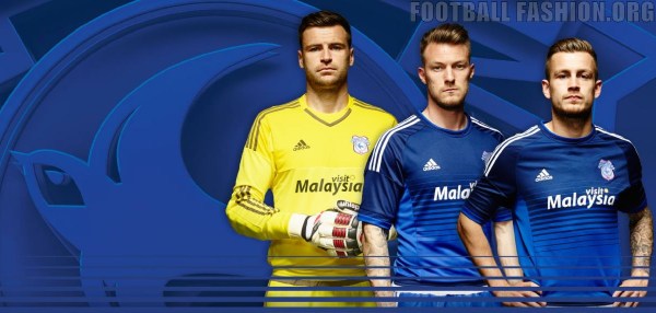
As everyone awaits the big unveil of next year’s strip, I have delved through nearly twenty years worth of kits and rated them based on nothing other than my own personal preference.
You’ll all have your own favourites, some of you may even rate that black and yellow ladder one Cardiff had a few years back, but you would be wrong. Very wrong. I have also disqualified the rebrand kits for obvious reasons, although I was rather partial to the white and red one that hardly ever got used.
So without further ado, kit number 10 is;
10 – Third strip 2015-16

Nothing makes you desire a kit more than a prohibitive £699 price tag. Only available to sponsors, this striped ensemble was never worn in a match or likely to be ever needed, but it’s pretty cool and if anyone out there has one, please send VFTN a picture of you wearing it because I’ve never seen one in the flesh!
9 – Home 2001/02
http://gty.im/1074399
Well it’s the kit they beat Leeds in, need I say more. Not Cardiff’s finest by any stretch, it was a slightly strange shape and had a big, ugly cricket collar. It was also super-baggy, as was the style back then, but Ken Thorne’s World of Cars was a pretty iconic logo while it lasted (the logo and the company) and the pinstripe across the middle was a nice touch. Also available in red and in green.
8 – Away 2007/08
http://gty.im/80542147
Well it’s the kit they wore in the FA Cup final, need I… The second best of the Joma efforts (see number four), you can’t help but look sharp in a black kit. There are just not enough black kits in football and not enough yellow in Cardiff’s kits in general. Their second best black kit (see number two!).
7 – Home 2004-05
Definitely the shiniest of all the Cardiff kits in this list, the 2004-05 vintage was worn by a fleet of exciting Cardiff players including the likes of Danny Gabbidon, Graham Kavanagh, Robert Earnshaw, James Collins, Richard Langley, Joe Ledley, Cameron Jerome, Junichi Inamoto, Jobi McAnuff, Gary O’Neil and Peter Thorne (swoon), who used to tuck his collar in. What a great team that had that year, yet they were shit and nearly went down!
6 – Away 2011-12
I could easily have opted for the blue equivalent for this one, but I do like a white kit, despite the Swansea and England connotations. The blue, white and yellow combination will always be a winner in my book, but is seldom incorporated. There were a few nice Puma kits, see also number four and number two.
5 – Home 2016-17
Embed from Getty Images
Simple and classic. Maybe the most inoffensive of all recent Cardiff kits and basically an off-the-peg blue version of the Wales kit at the time, but very easy on the eye. It also had the classier Visit Malaysia sponsor logo that was replaced last year by a Sunday League-standard equivalent. Also a big fan of clubs producing their kit nice and early, then wearing it on the final day of the preceding season, which Cardiff did in this instance.
4 – Away 2002/03
It was just like watching Brazil. Almost anyway. I’m not sure if ‘Disco’ Des Hamilton would have made it as a footballer it in South America, but it certainly helped Cardiff look the part in their promotion season. Another Puma ensemble, featuring the classic badge too, positioned centrally like on the FA Cup shirt. A baggy and beautiful effort, just like how your dad used to like them.
3 – Home 2008/09
Big fan of the off blue used in this kit. The best Joma effort, but as anyone who had one will attest, it was a very heavy shirt. Maybe that’s why Cardiff narrowly missed out on the play-offs that year? Marginal gains and all that. Again, the blue, white and yellow are all present and correct, here’s hoping that Cardiff experiment with different hues of royal blue again in the near future.
2 – Home 2010/11
This was so close to taking the top spot. I’m still conflicted. The best Puma kit, the best black kit (those paying attention will now know that I do like a black kit) and Cardiff wore it when they won 4-0 at Leeds, which may be the best I’ve ever seen Cardiff play. It just looks cool. The yellow trim, the blue badge, the bold sponsors logo, even if it does promote gambling (which is evil and wrong kids). Cardiff’s most badass kit.
1 – Home 2015/16
This is just a beautiful kit. It’s Adidas, and I truly hope Cardiff have Adidas kits forever, has the three stripes on the shoulder and blends from a dark blue in to a lighter blue, which could have made them look sweaty, but didn’t. I also really regret not buying it. I have the badass black one, but not this one, so if anyone out there has a spare in XL, contact VFTN and I will pay good money for it!
What is your favourite Cardiff City shirt? Let us know in the comments below or on Twitter @VFTNinian.
Feature image credit: Jon Candy
